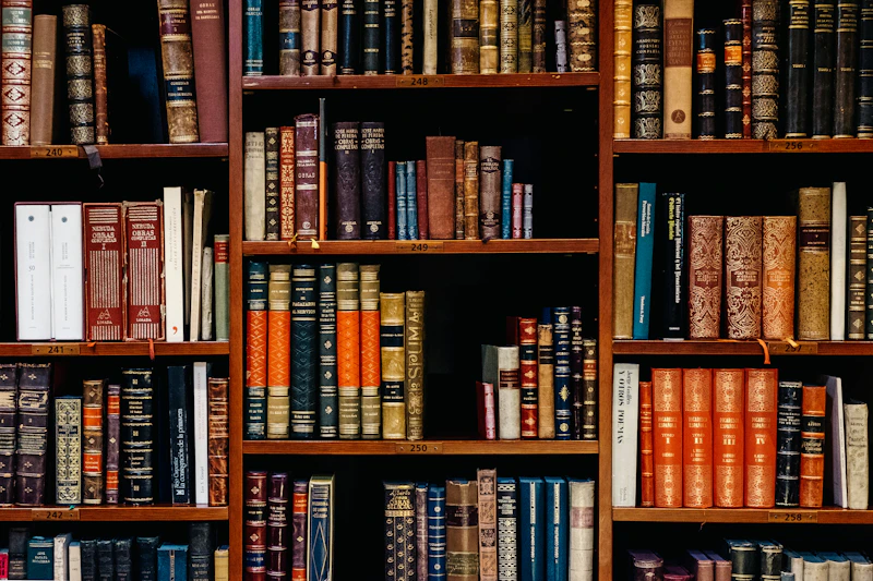
A sensory exploration of paper weight, the scent of soy ink, and the contemplative pause that only a well-made physical print publication can offer.
Written by the Alinea Research Team
Amid the rushing current of fast-moving digital imagery, a large-format art book asks for a different rhythm of contemplation. The touch of acid-free paper fibres, the distinctive scent of plant-based ink, and the pause between pages create a sensory experience that lets the ideas of spatial designers and art lovers settle.
We are often asked, especially by younger visitors at our reading table, why a small publisher still insists on printing thick monographs when almost any image can be viewed in high resolution on a phone screen. It is a fair question, and the answer is not nostalgia. Screens and paper are two media that work on our attention in different ways. One is designed to flow without end; the other is built from limits: the edge of the page, the central fold, and a thickness you can feel. This essay tries to unpack those differences one by one.
A Weight You Can Feel
The first thing the hand notices when opening an art book is its weight. Paper weight, the mass of paper per square metre, determines how a page falls, how slowly it turns, and how much light passes through to the other side. Thick uncoated paper offers a slightly rough surface, so the ink sits within the fibres rather than floating on top. The result is an image that feels calmer and deeper, especially in reproductions of architectural drawings, charcoal sketches, or black-and-white photographs.
That weight also shapes the way we read. A heavy book is not read standing on a train. It asks for a table, a chair, and a little time. Without realising it, the reader prepares before opening the first page, and that small preparation is part of the experience, not an obstacle. The hand also learns to map the book: we remember that the plan we are looking for sits roughly a third of the way in, on a left-hand page, beneath a photograph of a façade. This kind of spatial memory is hard to form when all content appears in the same frame.
Scent and the Trace of Ink
Plant-based inks, such as those made with soybean oil, have a gentler scent than petroleum-based inks. For some people that scent is a mere detail, but for readers used to printed books, the smell of new paper often marks the beginning of an encounter. Over time the scent changes, mingling with the air of the room, the wooden shelf, and the hands that open the book. Slowly, the book keeps a trace of the place where it lives.
On the production side, the choice of ink is also tied to how colour settles on uncoated paper. A careful printer will run several tests before finding the balance between dense and open, especially for skin tones, wood, and the shadows in interior photographs. The process is slow and not always efficient, but that is where the difference lies between a book that merely prints images and a book that truly cares for them.
The Pause Between Pages
Turning a page is a punctuation mark we never write. Art book designers use it deliberately: a single photograph is left alone across a two-page spread, a blank page is placed before a new chapter, or a floor plan is separated from its photograph on purpose so the reader has to turn back and remember. This rhythm resembles the way we walk through a building, from a narrow corridor into an open room.
Screens make us scroll; paper makes us stop. Between two pages there is a small space where thought has time to settle.
On screen, that rhythm tends to disappear. Scrolling turns every image into a uniform stream, and the next button is always there before we have finished looking. That does not make digital media bad; it simply prioritises speed and continuity. An art book works the other way around: it sets limits, then trusts the reader to pause within them. There are no notifications to interrupt.
Colour That Does Not Glow
Another difference that is often forgotten is the nature of light. A screen emits light from behind the image, so colours look bright and contrasty, sometimes more dramatic than the original. Paper only reflects the light that falls on it. That is why reproductions of paintings or textiles in a book come closer to how we see the original work in a gallery: dependent on the room's light, the viewing angle, and distance. The white of the paper, whether natural white or slightly cream, shapes the mood of the entire page. That is also why we suggest viewing art books near a window or under warm lamplight, rather than beneath a glaring white light.
An Object That Ages With Its Reader
Acid-free paper is designed not to yellow and become brittle quickly. With good care, a book like this can outlast the devices we use to read today by a wide margin. It needs no software updates, does not depend on a file format, and can still be opened decades later by someone we will never know.
A book also keeps traces of its owner: pencil notes in the margins, an exhibition ticket tucked between pages, or a small crease on the page opened most often. These traces make every copy different, even when printed from the same plates. That is why collectors often treat monographs as personal archives rather than mere reference material.
When curating a new title, we usually check the following before deciding a book belongs in our catalogue:
- The type and weight of the text paper, and whether it is acid-free.
- The binding method, especially whether the spine is sewn so the pages can open wide enough.
- The quality of image reproduction in dark tones and fine detail.
- Whether the book's format suits its content, rather than simply being impressively large.
Not a Rejection of Screens
We are not campaigning against screens. Digital archives are extremely useful for quick searches, for sharing references with colleagues, and for opening access to readers far from a bookshop. Much of our own research begins with screenshots and online catalogues. But when a visual idea needs to be understood as a whole, with its scale, sequence, and materiality, the printed book is still the most honest medium. The two can live side by side, as long as we know when to move from one to the other.
For readers who want to experience the ideas in this essay for themselves, the monograph Tipografi Nusantara: Bentuk & Makna Aksara is a good place to start. It is printed in a limited edition with a linen cloth binding stamped in gold, on paper chosen specifically for reproducing letterforms, so that every curve of every character can be studied up close, page after page.